
How to customize Hashnode blog with custom CSS
Tips & Tricks to customize your Hashnode blog!

I work as a Tech Arch Senior Manager at Accenture and am a mother to two wonderful kids who test my patience and inspire me to be curious. I love cooking, reading, and painting.
I recently moved my blogging site from a WordPress platform to Hashnode. One of the key features that sold me out is the ability to add custom CSS. This post covers some of the tips and tricks I learned while setting up custom CSS for my blog.
One may question why should we resort to such stress to personalize one's own blog? Well, there are many reasons and they vary with your interests. For me, it is to test out the feature and understand the design mechanism behind the development. Also, let's not forget the fact that I want my blog to stand out and not look like every other blog.
Before we begin it is important to note that the custom CSS feature is currently enabled only for ambassadors. For more details on how to become an ambassador, check out this link. And, for those ambassadors who are interested in learning about how to enable custom CSS, save the changes and publish them, follow this link.
Awesome! Now you are all set up to write CSS for your website. Let's start this mission...🏁
Navigation

This is the first item I worked on. I personally didn't like how the website navigation links are on one line and the social media icons are displayed on the next row. I changed this by targeting the .blog-sub-header container which wraps both the nav links and social media links. This is achieved by adding the following code:
.blog-sub-header.items-end {
    align-items: center;
}
Media Queries
Now that we have achieved displaying all links in one single line, I noticed they overlap from 450px width and less. Add the following to change the flex-direction to column using the following code:
@media only screen and (max-width: 450px) {

    .blog-sub-header {
        flex-direction: column;
        align-content: space-around;
        justify-content: center;
    }

}
You can do much more to the navigation links by adding hover color effects to these classes:
- .blog-sub-header-nav a
- .blog-social-media-section a

Header Background
There are two style options to choose from for the header section and again this is a personal preference. Do you want the full width of the header to display certain background or just the container that has the logo and navigation links?
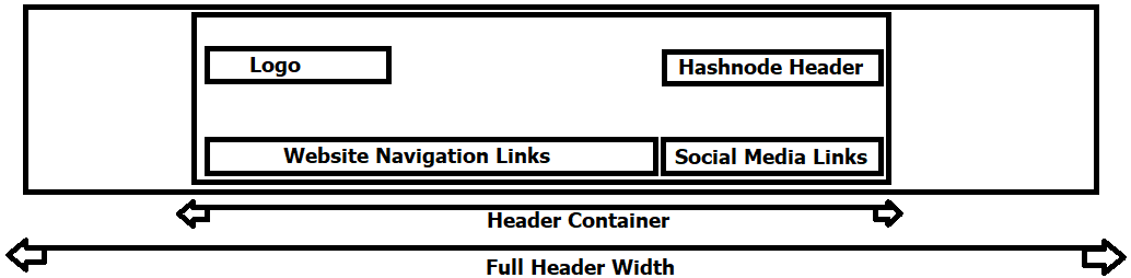
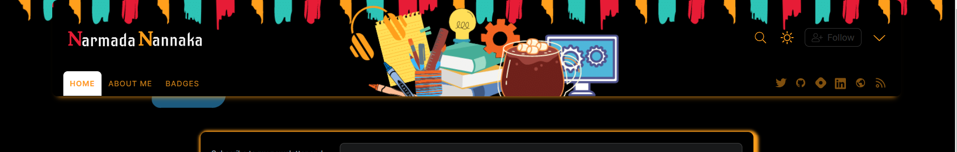
To update the background for the full header width, use .blog-header class like this one here:
Now to target just the container, use .blog-header .container classes like this one here:
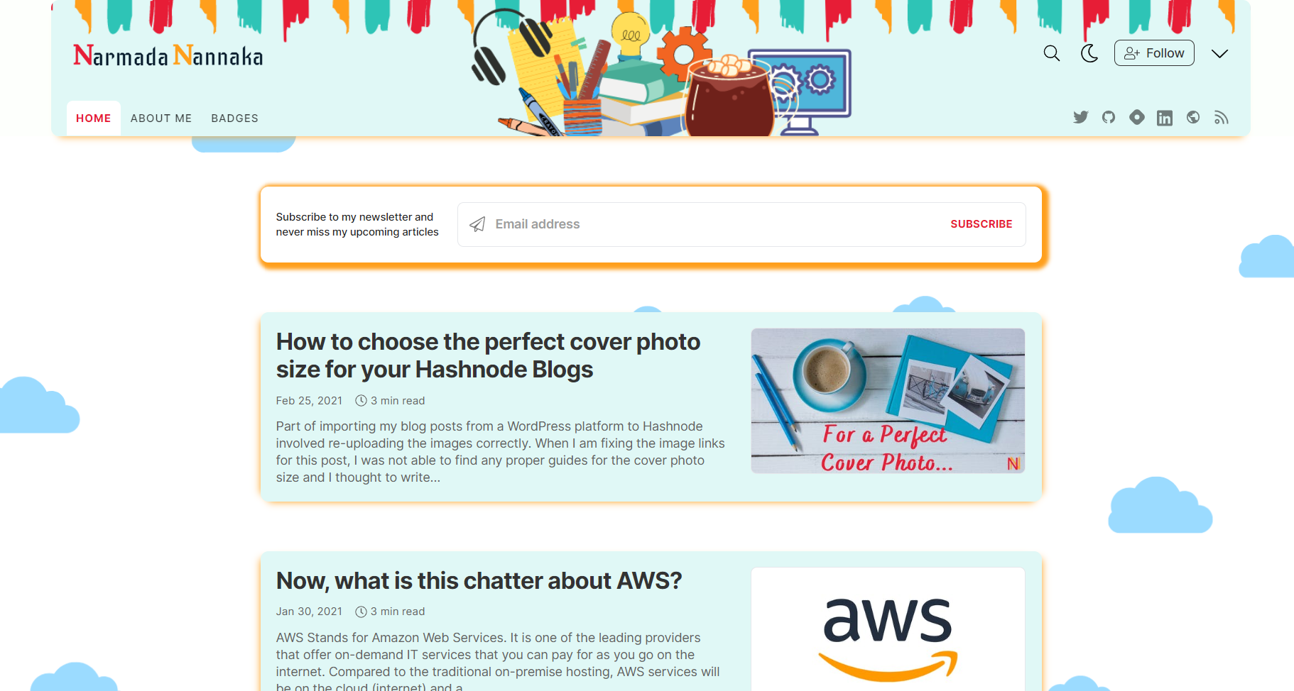
Bonus Tip!!! 🤩🤩
You will notice in the above screenshots that I targeted a full width in dark mode and just the header width for normal mode. This can be achieved by applying your full background to .blog-header and by inheriting the parent background for .blog-header .container in dark mode.
Main Section
Again depending on the page you are targeting, the main body section consists of different divs/containers for the author card, newsletter subscription form (if you have it enabled), blog items listed as cards, blog detail (for the articles page), content of the additional pages. Some key classes to target here are:
- .blog-subscription-form
- .blog-subscription-form-wrapper.
- .blog-post-card
- .blog-similar-article-wrapper
- .blog-page-title
Hide/Remove a section.
You will notice I removed the author card section from my home page and this is done using the following code:
.blog-author-card {
    display: none;
}
You might wonder why I didn't use the visibility attribute and set it to hidden. The visibility tag will hide the element but it will still occupy the space allocated for that element. Whereas, the display tag will hide the element as if it is not there. So, you know now. 😎
Articles and Pages
When you make changes to your header and footer, ensure those changes are copied across to all the sections of your website - Home, Articles, and Pages tabs.
Dark Mode
You can add a different styling for an element to accommodate the dark mode. This can be achieved by adding .dark before your target classes. Sample code below updates the text color from black to yellow when dark mode is enabled:
.dark .blog-header .text-black {
    color: #ff9f1c;
}
If you chose a custom background for the header and blog content like I did, make sure relevant images are referred to in dark mode.
Challenge
One task I found difficult to solve is to style the author card background-color which is fixed to the div element as an inner element style. The only way to override is to use !important property to the custom CSS. Let me know if you know of a different way to override it without using the !important property. So, what are you waiting for, give it a try by joining Hashnode here?
Thank you for Reading - Let's Connect!
Enjoy my blog? For more such awesome blog articles - follow, subscribe and let's connect.